I'm not really loving the tribal. Its like the old guy that wants a tattoo to be cool. Classic tramp stamp design. Sorry just my opinion. I like our logo with the silhouette. Or just the logo. I like it simple. Looks classy.
So I understand what you are saying, the one above was taken from the image at the top of the forum home page, it is laying on black, so when I take the black off it looks like that. It is the same logo.
=
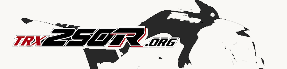
with the background removed
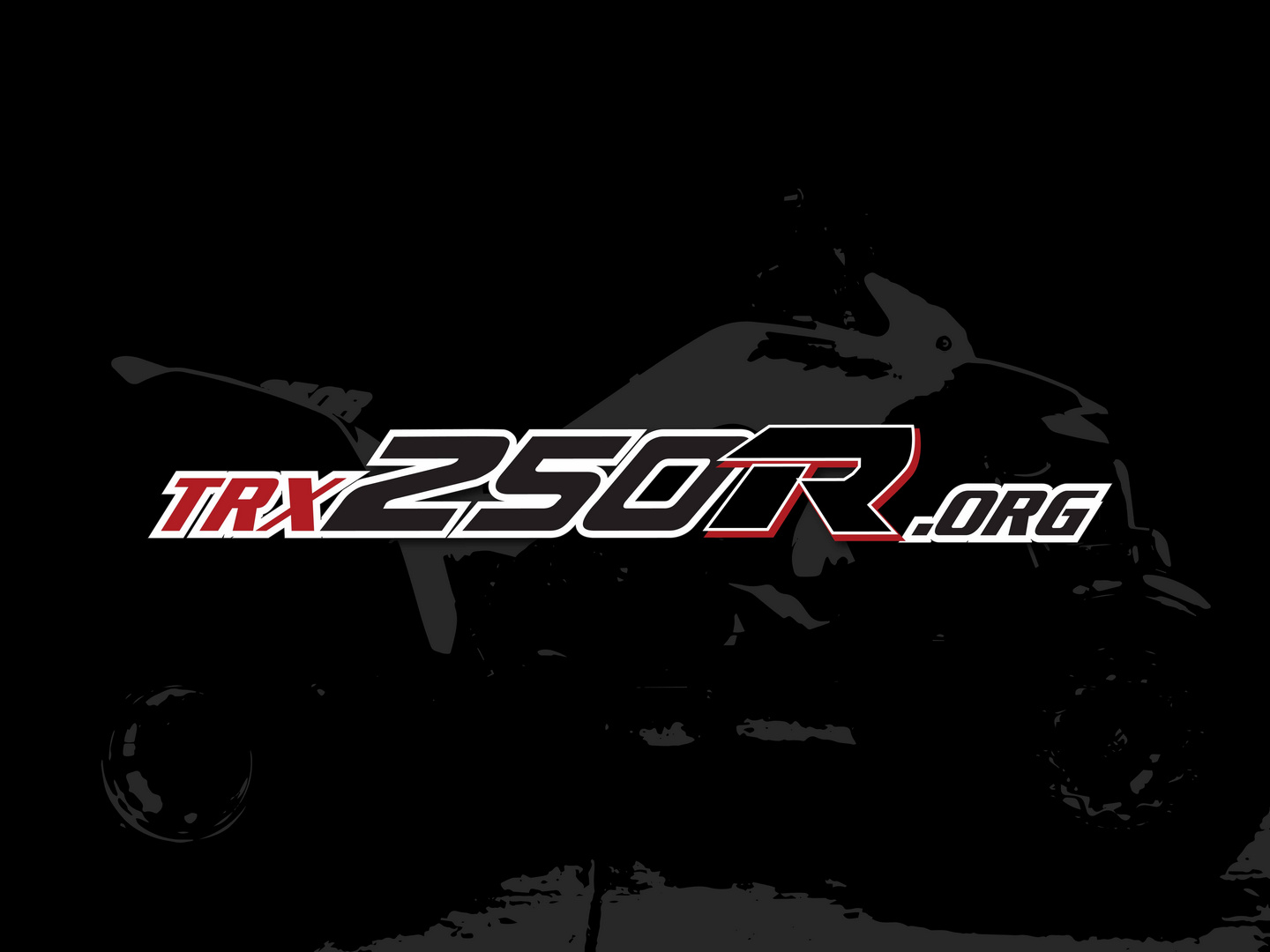
this is the full graphic spiritaces sent me, but it needs better defination for the quad to be reconizable, which can be fixed for full back. that is what I am working on, and why I was asking about adding the swooshy lines when i fix the quad...
I just want to come up with a great design that you guys will be proud to wear!


